In-car UX, short for in-car user experience, is the way a driver or passenger interacts with a vehicle’s digital systems. That includes touchscreens, buttons, steering-wheel controls, voice assistants, navigation menus, phone integration, alerts, media systems, and the logic that connects them. In practice, in-car UX is not just about convenience. It is also about how safely a person can complete a task without losing too much attention from the road.
This matters because modern cars now ask drivers to interact with more software than ever before. Navigation, media, messaging, climate settings, calls, charging information, and driver-assistance features are often routed through screens and menus rather than dedicated physical controls. That shift has created a basic design problem: the more complex the system becomes, the more care is needed to make it usable without creating distraction.
The original FP7 GET HOME SAFE project was built around this exact challenge. Its goal was to develop safer multimodal search and communication systems for drivers, especially in situations where people wanted to access internet-based functions in the car without resorting to risky manual smartphone use. That makes in-car UX the natural foundation topic for this site.
What does in-car UX actually include?
Many people hear the term and think only about the center touchscreen. In reality, in-car UX covers the full interaction model of the vehicle. It includes visual design, menu depth, button placement, spoken prompts, feedback sounds, screen response time, alert prioritisation, and how easily a driver can recover after making a mistake.
It also includes the relationship between different input methods. A car may let the driver use a touchscreen, a rotary dial, steering-wheel controls, or voice commands to complete a similar task. The quality of the user experience depends on whether those methods are intuitive, consistent, and appropriate for use while driving.
This is why in-car UX sits at the intersection of software design, human factors, and road safety. A polished-looking interface can still be a poor driving interface if it forces long glances, too many steps, or frustrating corrections.
Why is in-car UX now a safety issue rather than just a design issue?
Older cars usually separated major functions across dedicated knobs, switches, and simple radio displays. Modern vehicles often centralise these tasks into one or two digital surfaces, which can save space and enable updates, but can also increase interface complexity. As more features move behind menus, the design of the interface starts to affect how much attention the driver must divide between the road and the system.
Road-safety research has focused for years on the risks created by visual-manual distraction. Those concerns have only become more relevant as dashboards have become more software-driven and drivers are expected to manage more non-driving functions while the vehicle is moving.
A poor in-car interface does not need to fully capture the driver’s attention to create risk. Even short glances away from the road, repeated over several steps, can interrupt hazard detection, lane control, and situational awareness. In other words, a badly designed interface can be dangerous even when the driver thinks they are only doing something minor.
What is driver distraction in practical terms?
Driver distraction is often divided into three broad types: visual distraction, manual distraction, and cognitive distraction. Visual distraction happens when the driver looks away from the road. Manual distraction happens when the driver removes a hand from the controls to interact with something else. Cognitive distraction refers to the mental load created by a secondary task.
Most in-car tasks involve more than one of these at the same time. Typing on a touchscreen, for example, usually demands eyes, hands, and thought. Voice systems can reduce some visual-manual demand, but they may still create cognitive load if the interaction is confusing, error-prone, or too slow. That is why designers cannot assume that a voice feature is automatically safe just because it is hands-free.
In practical terms, the safest interface is usually the one that demands the least time, the fewest steps, and the least uncertainty from the driver. Good in-car UX is not about adding more ways to do things. It is about making the most important tasks easy to complete with minimal attention shift.
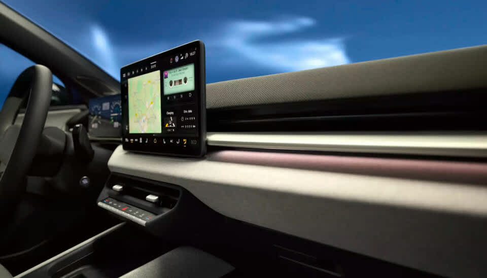
Why are touchscreens such a big part of the debate?
Touchscreens have become the symbol of the modern car interface because they are flexible and easy for manufacturers to update. One screen can replace multiple physical controls, support software changes, and handle navigation, media, settings, and vehicle information in one place. From a product and engineering perspective, that can be attractive.
From a driving perspective, the trade-offs are harder. Flat screens often remove tactile feedback, which means the driver may need to look at the interface more often to confirm where a control is and whether the input worked. That can be especially problematic for repeated tasks like adjusting temperature, changing audio sources, or navigating deeper menu layers.
Research on dashboard interfaces has repeatedly reinforced this concern. The point is not that all touchscreens are unsafe. It is that touch interaction is highly sensitive to workload, screen layout, and the number of steps required to complete a task.
Can voice assistants make driving safer?
Voice interfaces can help, but they are not a complete answer. Research on voice-based in-vehicle systems has shown that they can reduce some forms of distraction by lowering the need to look at displays or manipulate controls directly. That is a real benefit, especially for tasks that would otherwise require several manual steps.
At the same time, voice systems do not eliminate distraction completely. If the system misunderstands the driver, asks too many follow-up questions, or forces repeated corrections, the interaction can still become distracting and frustrating. A voice assistant that sounds advanced on paper may perform poorly in real driving conditions if it is too rigid or too slow.
This is exactly why the GET HOME SAFE project explored different speech dialogue strategies rather than treating voice as a simple fix. The project compared more command-based and more conversational approaches in order to understand how drivers interacted with voice systems under realistic conditions.
What does “multimodal” mean in a car?
A multimodal interface is one that lets the user interact through more than one mode, such as voice, touch, steering-wheel controls, visual menus, or audio feedback. In a car, the goal is not to maximise complexity. The goal is to give the driver the safest reasonable way to complete a task in context.
For example, entering a destination by hand while moving is usually a poor fit for the driving environment. A better approach may combine voice input with a short confirmation on the display and steering-wheel controls for quick corrections. In another situation, a physical shortcut for temperature adjustment may be more appropriate than any screen interaction at all.
Good multimodal design recognises that not every task should be handled in the same way. It also recognises that the best interaction method can change depending on speed, traffic, weather, or task urgency. This is one reason vehicle UX is more demanding than ordinary app design.
What makes a good in-car interface?
A good in-car interface helps the driver complete common tasks quickly, predictably, and with as little visual-manual effort as possible. That usually means clear information hierarchy, large and readable controls, minimal menu depth, consistent behaviour, useful feedback, and functions that match real driving contexts.
It also means accepting limits. Some tasks are simply too demanding to be appropriate while the vehicle is moving. Good UX does not just improve access. It also prevents unsafe interaction patterns by making certain features simpler, less distracting, or unavailable at the wrong time.
Another important feature is recoverability. Drivers will mishear a prompt, press the wrong icon, or interrupt a process halfway through. A system that makes it easy to cancel, repeat, or return to a safe state is usually better than one that looks advanced but is brittle under real-world use.
What makes a bad in-car interface?
Bad in-car UX tends to have a few recurring traits. It often hides common tasks behind too many layers, depends too much on visual confirmation, gives weak or delayed feedback, and forces the driver to remember menu structures rather than recognise them quickly. These problems may sound small on paper, but they become more serious when combined with speed, traffic, and the normal cognitive load of driving.
Another weak point is inconsistency. If similar tasks behave differently across parts of the system, the driver has to think more and trust the interface less. That can lead to repeated glances, hesitation, and frustration, all of which increase the burden of the interaction.
A third problem is feature overload. Modern vehicles can include powerful software, but more features do not automatically create a better driving experience. If the system tries to do too much at once, the result may be an interface that is impressive in demonstrations but difficult to use safely on the road.
How do navigation, messaging, and phone integration fit into this?
These are among the most demanding everyday use cases because they combine urgency, habit, and complexity. Drivers want to search for places, answer calls, send messages, or change routes while continuing to drive. That is exactly the kind of activity the GET HOME SAFE project tried to address through safer search and communication systems.
The challenge is that these tasks can quickly become multi-step workflows. A driver may need to search, filter, sort, confirm, and correct input, all while monitoring traffic. That is one reason safer in-car interaction remains such an important design problem.
This is why simple headline claims about “hands-free” technology are often incomplete. A task may technically be hands-free while still being mentally heavy or interaction-heavy. Safer in-car UX depends on reducing the total burden of the task, not just removing one physical action.
How does in-car UX relate to ADAS and driver assistance?
As advanced driver-assistance systems become more common, interface quality becomes even more important. Drivers need to understand what the system is doing, what it is not doing, when it expects intervention, and how alerts should be interpreted. Poor communication in these moments can create confusion or overconfidence.
This does not mean ADAS is the same as infotainment, but the two increasingly share the same interface space. Warnings, status indicators, route guidance, media controls, and phone functions may all compete for attention inside one digital environment. That makes prioritisation and clarity essential.
A strong in-car UX strategy therefore has to think beyond entertainment. It has to treat the entire cabin interface as a safety environment in which some messages are optional, some are time-sensitive, and some must override everything else.
What should drivers take away from all this?
The main point is simple: car software is no longer separate from driving safety. The way a vehicle handles menus, voice commands, prompts, touch interaction, and feedback can shape how much attention a driver loses during ordinary tasks. That makes in-car UX a real safety topic, not just a branding or design topic.
It is also worth avoiding easy assumptions. Touchscreens are not automatically bad, physical buttons are not automatically good, and voice assistants are not automatically safe. What matters most is whether the interface reduces time, confusion, and attention demand under real driving conditions.
That is the reason this area still matters in 2026. Cars are becoming more connected, more software-defined, and more dependent on digital interaction. If that interaction is well designed, it can reduce friction and support safer driving. If it is poorly designed, it can turn ordinary tasks into avoidable distractions.